Tuesday, April 21, 2015

Geometric Correction

Introduction:

This lab was designed to teach the student how to perform geometric correction. This is an important skill for the student to understand. There are two types of geometric correction that the student will be performing. This task is usually completed on satellite images prior to the the extraction of biophysical and sociocultural information. The data that will be used for this exercise was provided by Earth Resources Obersation and Science Center, United States Geological Survey and from the Illinois Geospatial Data Clearing House. 

Methods:

The first part of the assignment was image-to-map rectification. The two images used were a USGS 7.5 minute digital raster graphic (DRG). This raster covered the region around Chicago, IL and adjacent areas. The second was a satellite image of Chicago from the year 2000. In order to complete this task ground control points (GCP) needed to be added to the images. This assignment called for the image rectification method to be a first ordered polynomial. The minimum number of GCPs needed for this method is three, but the assignment called for four points to be added. Once the points were added, the student needed to assess the accuracy of their points by looking at the RMSE (root mean square error). This error explains how closely the two images line up with each other.

A good guideline for RMSE is to be below 0.5. This assures the accuracy of the image that is being rectified. Since this is the first example the students have had with image rectification, the goal was to have a RMSE below 2. Figure 1 shown below is the results of image-to-map rectification for the first portion of this lab.


Figure 1. The result of 4 GCPs used on a first order polynomial. 

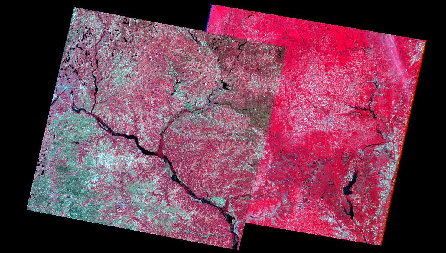
The second part of the lab was image to image registration. Two images of Sierra Leone in 1991 will be used for this analysis. One of the images was distorted and needed to be adjusted according to the correct image. These images will use a third order polynomial. Instead of three points needed like a first order polynomial, a third order polynomial needs a minimum of 10 GCPs to adjust an image. This assignment called to go above the minimum slightly and input 12 GCPs. Since this was the the second round of using GCPs, the assignment called for a lower RMSE. This example called for the RMSE to be lower than 1. Figure 2 shown below is the result of the 12 GCPs.


Figure 2. The result of 12 GCPs used on a third order polynomial.


Conclusion:

It is important to know your study area to accurately assess how many GCPs will be necessary to accurately geometrically correct an image. There are many methods out there on how to change the images that are being worked with. Knowing which method to use will greatly affect the success rate of geometric correction.

Sources:

Earth Resources Obersation and Science Center, United States Geological Survey

Illinois Geospatial Data Clearing House. 


Wednesday, April 15, 2015

Background:

The main goal of this assignment is to give the student a background working with Lidar data. The data provided for the class  was a Lidar point cloud in LAS file format. There were two tasks the students had to complete by the end of the lab. The first task is learning the processing and retrieval of various surface and terrain models. The second task was creating an intensity image from the Lidar point cloud.

Methods:

For this particular assignment, the class was instructed to use ArcMap instead of ERDAS Imagine. The first step was to create a new LAS dataset within our class folder. This newly created dataset will be the data used during the duration of the assignment. Once the dataset was created, the LAS files had to be imported into the new LAS dataset. After all the data was imported, the student analyzed the statistics and metadata to learn which projection the Lidar data was collected.

The next step was to explore the data a little further. In order to do so, the student had to enable the LAS Dataset Toolbar. Once the toolbar was active, the elevation, slope, aspect and contour lines could be shown from the point cloud data. After these tools were explored, the student then learned how to filter out which returns were being shown in ArcMap.

The first Lidar data product to be created was a digital surface model (DSM). This model is the first returns of the Lidar data. Typically it includes tree tops, buildings or houses. When creating this model the pixels were created to be 2 meters by 2 meters. Once the DSM was created, a hillshade was then created. The hillshade from the DSM allows for easier image interpretation.

The second Lidar product to be created was a digital terrain model (DTM). This model is the bare earth returns. It could include first returns if the only return was off the ground surface, but more than likely, it encompasses returns after the first. Once the DTM was created, a hillshade was created with the same guidelines as the DSM.

The last task was creating an intensity map of the Lidar point cloud. An intensity map shows the strength of the pulse that generated a particular point. This map was created using the same tools as that created the DSM and DTM. The only difference was changing the value field to INTENSITY in order to map the intensity. Once this map was created, it was then exported into a TIFF file to be shown in ERDAS Imagine. The reason for showing it ERDAS Imagine instead of ArcMap was becuase the image appears dark within ArcMap.

Results:

Figure 1. This is a hillshade model of the digital surface model (DSM) created within ArcMap
using Lidar point cloud data. 

Figure 2. This is a hillshade model of the digital terrain model (DTM) created within ArcMap
using Lidar point cloud data.
Figure 3 This is an intensity map of the strength of the return for each individual point.

Sources:

Eau Claire County, 2013.

Mastering ArcGIS 6th Edition data by Margaret Price,
2014.


Wednesday, April 1, 2015

Miscellaneous Image Functions

Goal and Background:

This assignment had multiple tasks to teach the student many aspects of working with different remotely sensed images. The first task taught the student how to decipher their selected study area out of a a large satellite aerial image. The second taught how to optimize the resolution images. With a higher resolution, it allows for easier visual interpretation. Radiometric enhancement was the third technique that was taught in the assignment. The students were taught how to link Google Earth with Erdas Imagine for more aerial interpretation. Multiple methods of image mosaicking were taught to the students. The final task for this assignment was working with binary change. This change was then mapped using ArcMap.

Methods:

The first method that was used was image subsetting or creating an areas of interest within a particular study area. For this particular example Chippewa and Eau Claire County were chosen as the area of interest. The image below (Figure 1) shows the results of this process.

Figure 1. Shows the results of subsetting an area within a study area.


The second step involved increasing the spatial resolution of an image. The first image used had a 30 meter resolution while the second image had a 15 meter resolution. By resampling the images it allowed for the original image to have a more crisp appearance. With a higher spatial resolution, it allows for easier aerial photo interpretation.

The third step was a basic radiometric enhancement of a particular image. The technique used was haze reduction. After running this tool, it allowed for the image to appear clearer and more crisp. It did not have a higher spatial resolution, but by reducing the haze it gave it the appearance of having a higher resolution.

The next step involved linking Google Earth with the Erdas Imagine image viewer. Once the views were linked, it allowed for a different form of aerial interpretation to take place.

The sixth task was image mosaicking. Two images were provided from May 1995. The two different techniques there were used were mosaic express and mosaic pro. The image below (Figure 2) shows the results of the mosaic express.

Figure 2. This image is the result of mosaic express. There is not a gradual combining of the images and a very distinct boundary between the two. 

The results of this process were not mixed together very well. The two images have two different color schemes and do not blend well together. The figure below (Figure 3) shows the results of using mosaic pro.

Figure 3. This is the result of mosaic pro. The images are blended together much smoother and the color scheme is much similar between the two images. 

These two images blend together much better than figure 2. The color schemes are very similar and there is not as distinct of a line between the two different images. There were many more options to choose how the blended together using mosaic pro.

The final step in the assignment involved image differencing or binary change detection. The particular are being analyzed included Eau Claire County and four other neighboring counties. The difference will be conducted between the years of 1991-2011. In order to see where these changes fall, it is necessary to look at the metadata. The graph below (Figure 4) is a histogram of the data for the image differencing.

Figure 4. This is a histogram of the metadata showing where
the tails are located that dictate whether there was change or
not on the land. 


The differences typically fall on the tails of the graph. The tails are marked by vertical red lines. Values greater than 75.049 and lower than 27.789 are considered to be changed areas.


Although the histogram shows what values represent change, it is not easy to see without mapping this particular data. The map below (Figure 5) shows the results of the image differencing. Many of the changes that occurred happened in rural areas of the selected counties.

Figure 5. This is the map showing which areas experienced change and which areas did not. 

Sources: Earth Resources Observation and Science Center, United States Geological Survey
               Mastering ArcGIS 6th edition Dataset by Maribeth Price, McGraw Hill. 2014.